Developing a consistent brand starts with creating a brand style guide. These branding rule books help graphic designers, marketers, web developers, community managers, and even product packaging departments all stay on the same page, and present a unified vision of the brand to the public.
The best brands stick in our brains because their presence is defined by the repetition of the same logo, fonts, colors, and images. Once we see them enough, they become instantly recognizable, bringing us a clear sense of reliability and security. All of this is possible when each member of your team adheres to a cohesive brand style guide.
In this article, we’ll go over what brand guidelines are, the elements of a style guide, and some amazing examples of them in action to use as inspiration for your next branding project or website redesign.
What are brand guidelines?
Brand guidelines, also known as a brand style guide, govern the composition, design, and general look-and-feel of a company’s branding. Brand guidelines can dictate the content of a logo, blog, website, advertisement, and similar marketing collateral.
Picture the most recognizable brands you can think of. Chances are, you’ve learned to recognize them because of the consistency across the messaging — written or visual — these brands broadcast. The same brand colors are reflected across them. The language sounds familiar. It’s all very organized and, while not rigid, it’s cohesive.
Here are a few types of guidelines you’d find in a brand style guide and which parts of a brand they can influence.
Download our free resource on how to create your own style guide with brand guidelines templates to follow. Creating a consistent style guide isn’t easy, but with these tools you can build an unforgettable one with ease.
The Elements of a Brand Style Guide
A brand style guide encompasses much more than just a logo. It visually encompasses everything your brand is about — down to your business’ purpose. Here are some key elements that make or break a brand style guide.
Mission Statement
Your mission statement is an action-oriented statement declaring your organization’s purpose, making it the compass of your brand style guide. It ensures that all your content is working toward the same goal and connecting with your audience. This statement can guide your blog and paid content, ad copy, visual media, and slogan.
Buyer Persona
A buyer persona is the fictional representation of your ideal customer. It includes details on your customer’s job title, age, gender, and professional challenges — therefore stipulating for whom your brand publishes content. Your buyer persona guides your blog content, ad copy, and visual media which can attract valuable leads and customers to your business.
Color Palette
Your color palette is a group of colors your company uses to design its brand, guiding every piece of visual content created. These color combinations often follow HEX or RGB color codes, and govern your logo, web design, printed ads, and event collateral.
Editorial Style Guide
The job of an editorial style guide is to commit an editorial stylebook on how to phrase certain products, list topics the brand can and cannot write about, and other companies it can mention. Your editorial style guide can guide your blog content, video scripts, website and landing page copy, PR talking points, and knowledge base articles. It can also provide direction regarding your brand’s voice and personality to ensure consistent messaging across all channels.
Typography
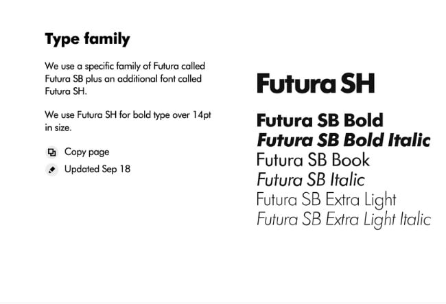
Typography is a visual element of your brand style guide that goes beyond the font you use in your company logo. It supports your blog design down to the links and copy on your website — even your tagline. Typography plays a major role in your website’s user experience, so you want to make sure it is visually appealing while also being accessible and easy to read.
As you can see, the purpose of the brand style guide is to form and maintain all of the various elements of a company that, when combined, spell out the entire brand as it’s recognized.
Intrigued? Check out 21 of the best ones we could find.
Style Guide Examples
- Medium
- Walmart
- Asana
- Skype
- Barre & Soul
- Spotify
- Starbucks
- Paris 2024
- Urban Outfitters
- Love to Ride
- Barbican
- I Love New York
- TikTok
- University of the Arts Helsinki
- Ivy Lane Events
- Western Athletic Conference
- Discord
- Netflix
- Scrimshaw Coffee
- NASA
- New York City Transit Authority
1. Medium
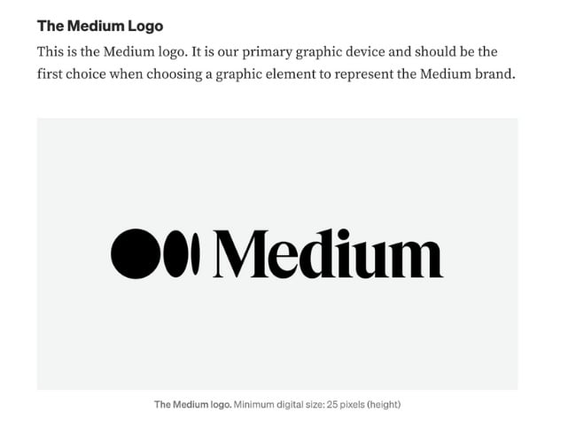
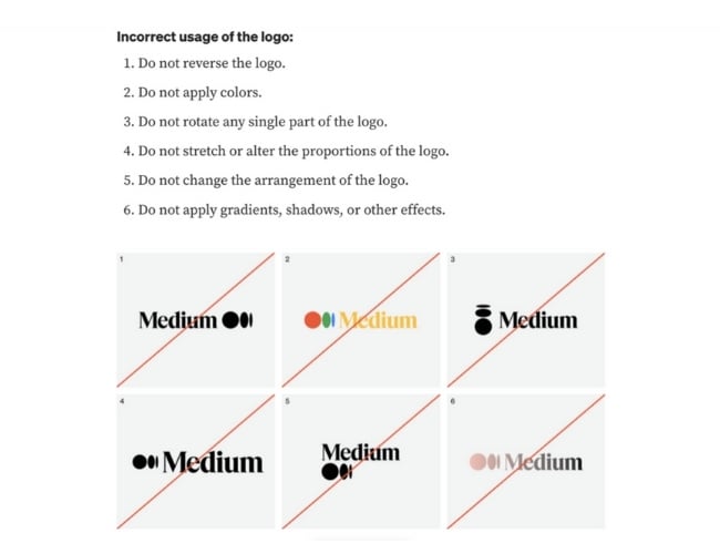
Medium simple brand style guide emphasizes usage of its logo, wordmark, and symbol. Medium’s logo is the brand’s primary graphic element and was created to feel “confident, premium, timeless, and modern.”
See the full brand guide here.
2. Walmart
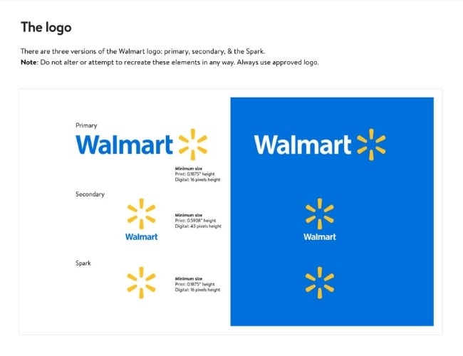
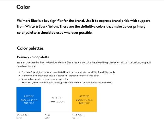
Walmart is one of the world’s largest and most recognizable brands, so it’s no surprise that its brand guide is extremely thorough. The guide includes the brand’s logo, photography, typography, illustrations, iconography, voice, editorial style, and more. Walmart’s color palette is so integral to its brand identity that its primary color is called “Walmart Blue.”
See the full brand guide here.
3. Asana
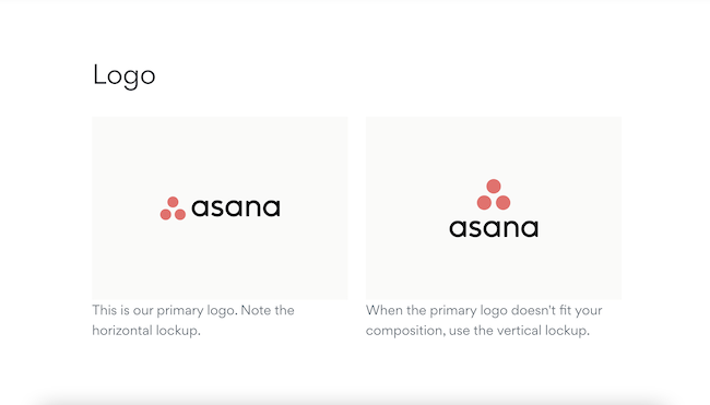
Asana’s simple style guide highlights its logo and color palette. It also explains how to properly use the brand’s assets.
See the full brand guide here.
4. Skype
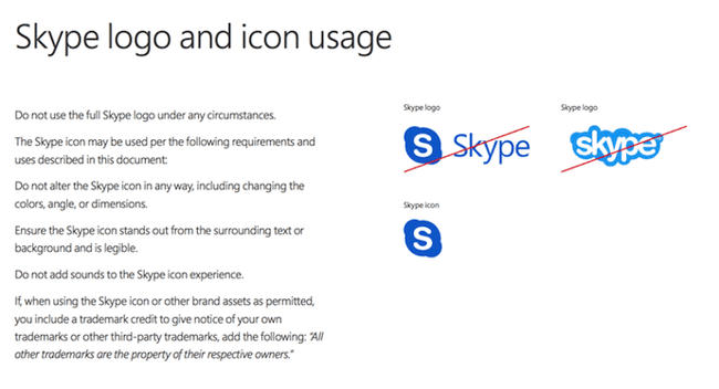
Everyone’s favorite video chat platform also has a squeaky-clean style guide for its brand. Skype, now owned by Microsoft, focuses primarily on its product phrasing and logo placement.
See the full brand guide here.
5. Barre & Soul
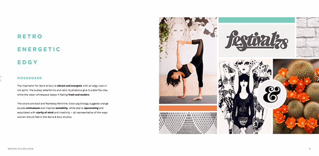
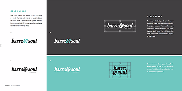
Barre & Soul’s brand style guide includes variations of its logo, logo spacing, secondary logos, supporting imagery, and a five-color color palette.
See the full brand guide here.
6. Spotify
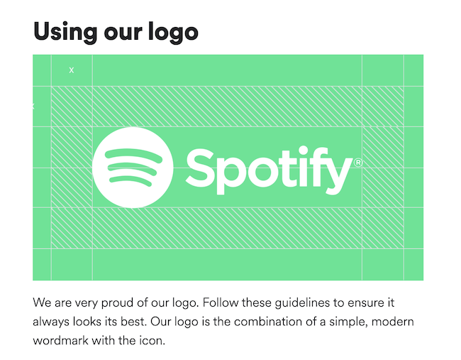
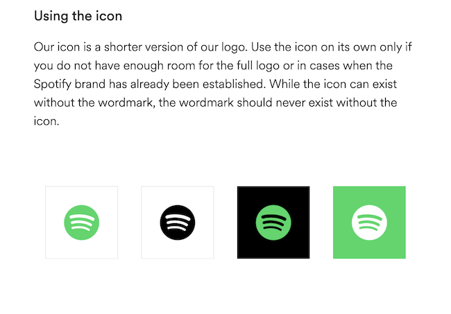
Spotify’s style guide might appear simple and green, but there’s more to the brand than just a lime green circle. Spotify’s color palette includes three color codes, while the rest of the company’s branding guidelines focus heavily on logo variation and album artwork. The style guide even allows you to download an icon version of its logo, making it easier to represent the company without manually recreating it.
See the full brand guide here.
7. Starbucks
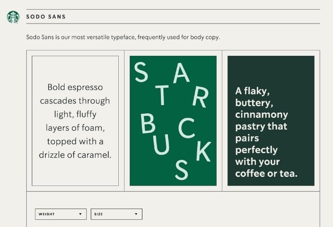
Starbucks’ interactive brand style guide includes details about how to use its core elements such as the iconic Siren logo and green color palette. Plus, the guide features a visual spectrum of how their creative assets can be used across different channels as well as case studies of different seasonal campaigns and product launches.
See the full brand guide here.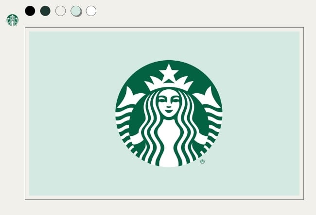
8. Paris 2024
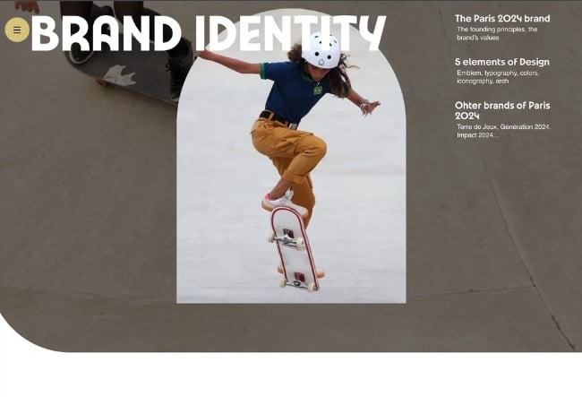
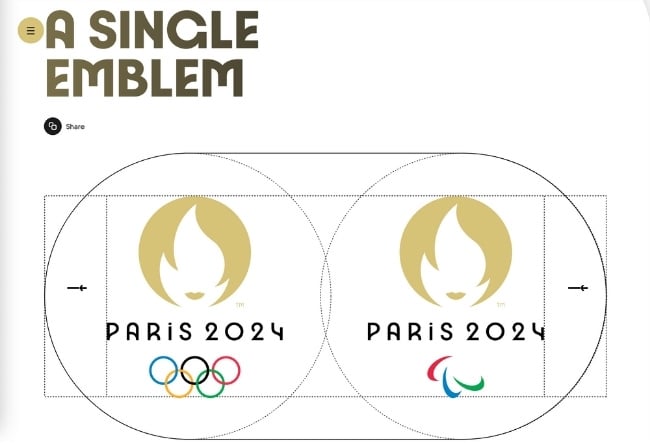
Paris 2024’s brand identity pays homage to the 1924 Olympic Games through Art Deco inspired design. The iconic emblem, color scheme, typeface, and iconography are all detailed in its brand guide. Best of all, designers applied eco-branding methods to Paris 2024’s brand materials to reduce the amount of ink and paper needed for physical materials as well as limit the power and data consumption on digital elements.
See the full brand guide here.
9. Urban Outfitters
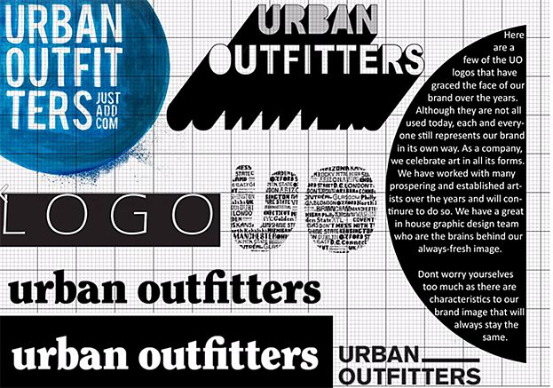
Photography, color, and even tone of voice appear in Urban Outfitters’ California-inspired brand guidelines. However, the company isn’t shy to include information about its ideal consumer and what the brand believes in, as well.
See the full brand guide here.

10. Love to Ride
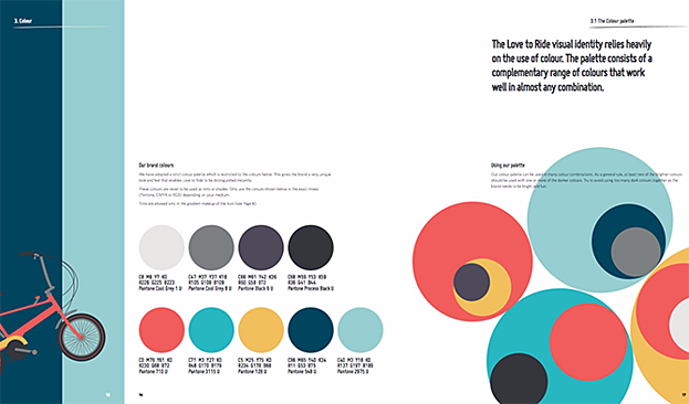
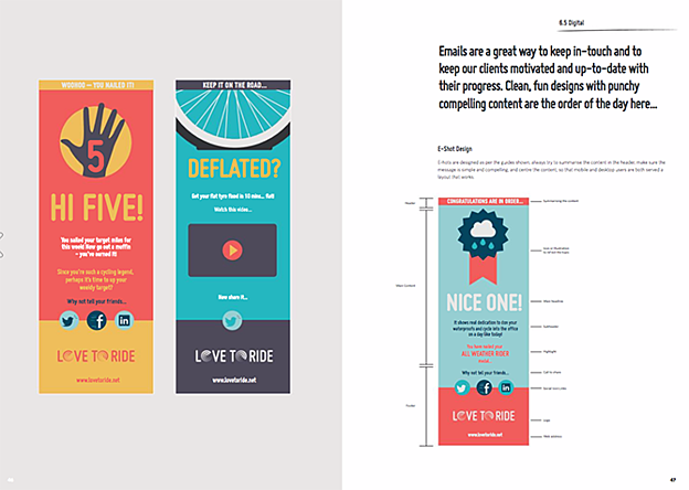
Love to Ride, a cycling company, is all about color variety in its visually pleasing style guide. The company’s brand guidelines include nine color codes and tons of detail about its secondary logos and imagery.
See the full brand guide here.
11. Barbican
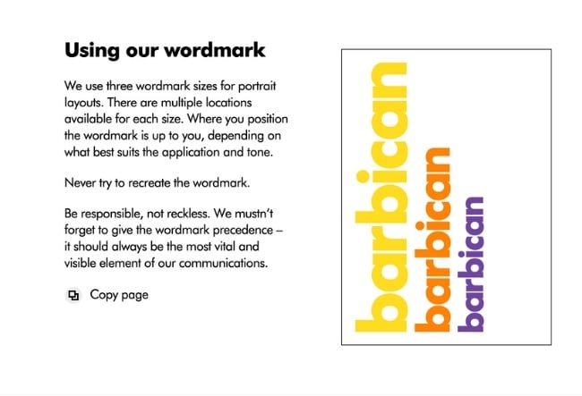
Barbican, an art and learning center in the United Kingdom, sports a loud yet simple style guide focusing heavily on its logo and supporting typefaces.
See the full brand guide here.
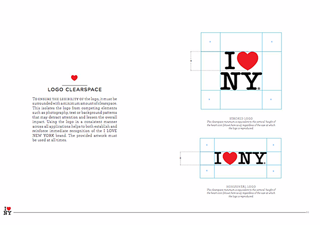
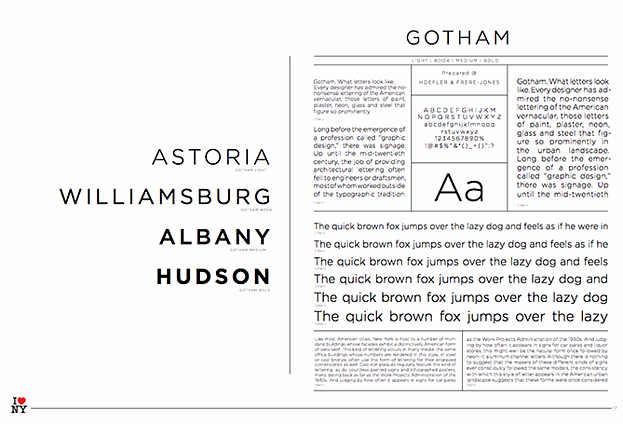
12. I Love New York
Despite its famously simple t-shirts, I Love New York has a brand style guide. The company begins its guidelines with a thorough explanation of its mission, vision, story, target audience, and tone of voice. Only then does the style guide delve into its logo positioning on various merchandise.
See the full brand guide here.
13. TikTok
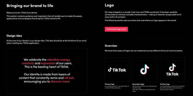
TikTok’s style guide isn’t just a guide — it’s an interactive brand book. First, it provides an in-depth look into how it brings its brand to life through design. Then, it gives an overview of its logo, co-branding, color, and typography. At its core, TikTok is a brand that “celebrates the relentless energy, creativity, and expression of [its] users.”
See the full brand guide here.
14. University of the Arts Helsinki
The style guide of the University of the Arts Helsinki is more of a creative branding album than a traditional marketing guide. It shows you dozens of contexts in which you’d see this school’s provocative logo, including animations.
See the full brand guide here.


15. Ivy Lane Events
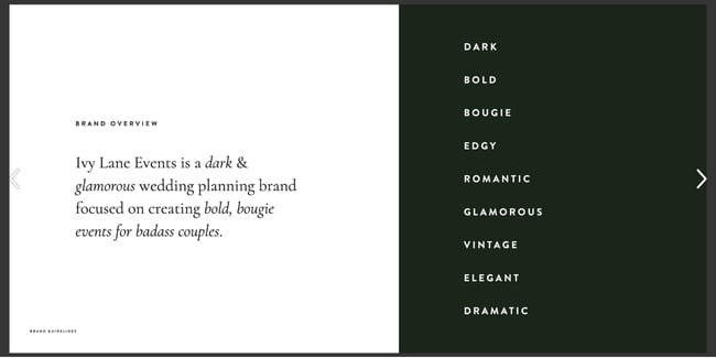
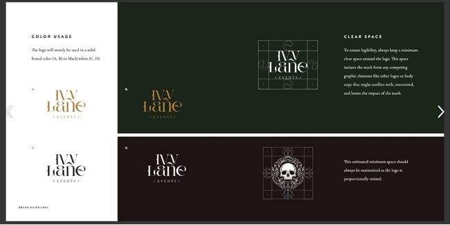
Ivy Lane Events’ bold style guide is reflective of the edgy events the company produces. In it, you’ll find a mood board with dark, romantic visuals inspired by “victorian gothic style and vintage book art.” The guide also details the proper usage design elements such as the wordmark, primary icon, secondary logos, color, and typography.
See the full brand guide here.
16. Western Athletic Conference
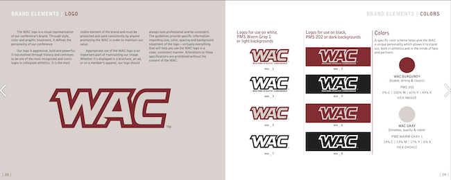
The Western Athletic Conference’s brand style guide includes extensive information about its history, mission, and vision. It also highlights its member universities and athletic championships and awards it is involved with. The brand elements include logo, colors, slogan, patch, and more.
See the full brand guide here.
17. Discord
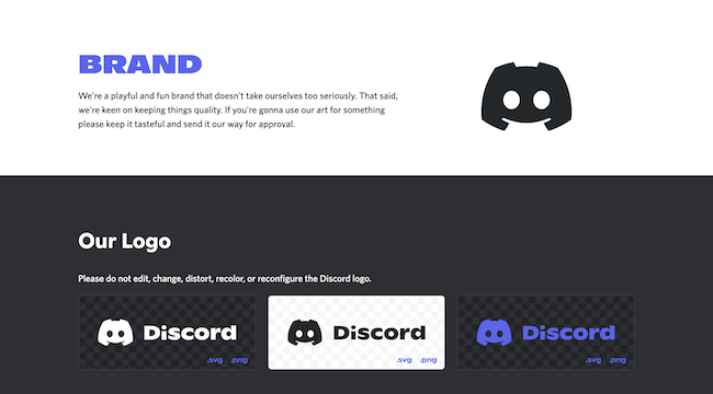
Discord’s brand guide is as colorful and playful as the communities it serves. The brand’s motion elements are based on the dot, which represents the Discord user interacting with others in the communities it belongs to. The guide describes usage of Discord’s typography, colors, and icon (lovingly named Clyde).
See the full brand guide here.
18. Netflix
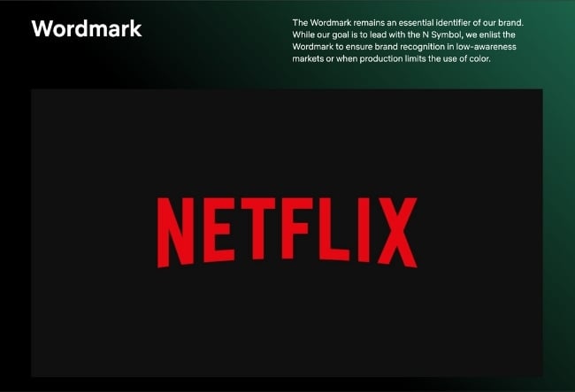
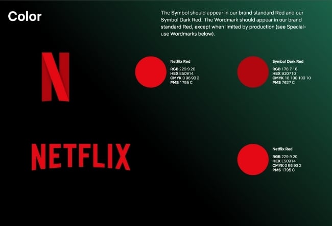
As far as its public brand assets are concerned, Netflix is focused primarily on the treatment of its logo. The company offers a simple set of rules governing the size, spacing, and placement of its famous capitalized typeface, as well as a single color code for its classic red logo.
See the full brand guide here.
19. Scrimshaw Coffee
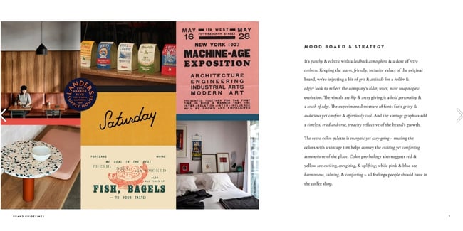
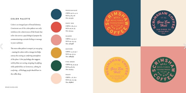
Featuring a six-code color palette, this “laid back,” “cool,” and “eclectic” brand has a number of secondary logos it embraces in various situations.
See the full brand guide here.
20. NASA
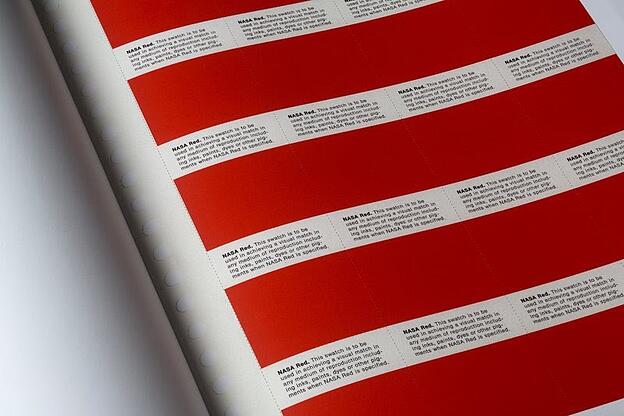
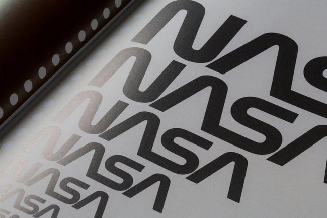
NASA’s “Graphics Standards Manual” is as official and complex as you think it is. At 220 pages, the guide describes countless logo placements, color uses, and supporting designs. And yes, NASA’s space shuttles have their own branding rules.
See the full brand guide here.
21. New York City Transit Authority
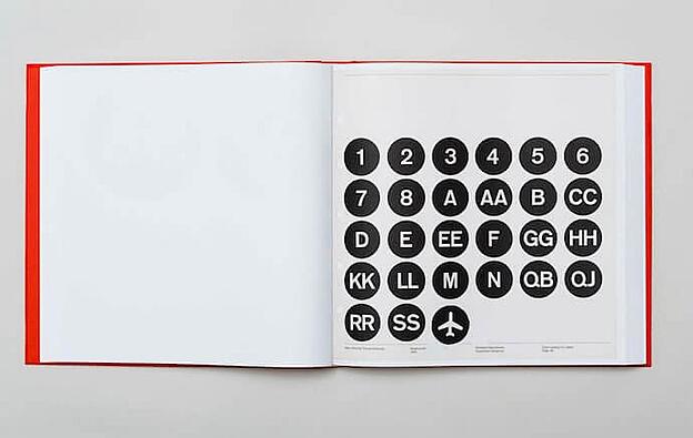
Like NASA, the NYCTA has its own Graphics Standards Manual, and it includes some fascinating typography rules for the numbers, arrows, and public transit symbols the average commuter takes for granted every day.
See the full brand guide here.

Build a Memorable Style Guide of Your Own
Once you build your unique brand style guide, customers will recognize your brand and associate it with all the visual cues you want them to. We hope you were inspired by our list of amazing brand style guides and wish you luck in creating a timeless style of your own.
Editor’s note: This post was originally published in January 2017 and has been updated for comprehensiveness.

